Cardknox Merchant Portal May 2022 Release Notes
Varone2022-05-18T13:31:33-04:00May 2022
Merchant Portal Updates
We’re wishing you a happy May from the team here at Cardknox! The team has been hard at work this season with another jam-packed release. Read on below to see new features and enhancements.
Let’s dive in!
To Try Out These New Features, Go to the Beta Portal and Update Your App Version
If you’d like to try out any of these new features in the Merchant Portal, you will need to access the Beta Merchant Portal. Click on the user icon (upper-right corner) and select ‘Enter Beta Portal.’ To return to the previous version of the Merchant Portal, click on the user icon again and select ‘Leave Beta Portal.’
To access them in the Cardknox Mobile App, be sure to update to the latest version available in the App Store/Google Play store.
We’ve added several new settings to the PaymentSITE Management functionality. Users can now:
New PaymentSITE Management Settings
We’ve added several new settings to the PaymentSITE Management functionality. Users can now:
- Add/remove card brand icons using the “Card Types Accepted” setting
- Remove credit card payments as an option (for merchants who only want to accept ACH)
- Add tabs and customize the tab’s display text
- Customize default receipt settings:
- Choose to always send customer receipts by default
- Show pop-up instead of receipt for approved sales
- Send receipt to printer by default
- Show logo on printed receipts
- Set the desired redirect URL for successful and failed transactions. You can configure this by clicking the “Add Redirect Options” checkbox and entering the URLs.
- Change the background color if their PaymentSITE theme is set to gray (the green theme does not support background color changes; the background color dropdown will only display if gray is selected).
Transactions and Recurring Modules Updates
We’ve made several enhancements to the Transactions and Recurring Schedules modules that you should know about:
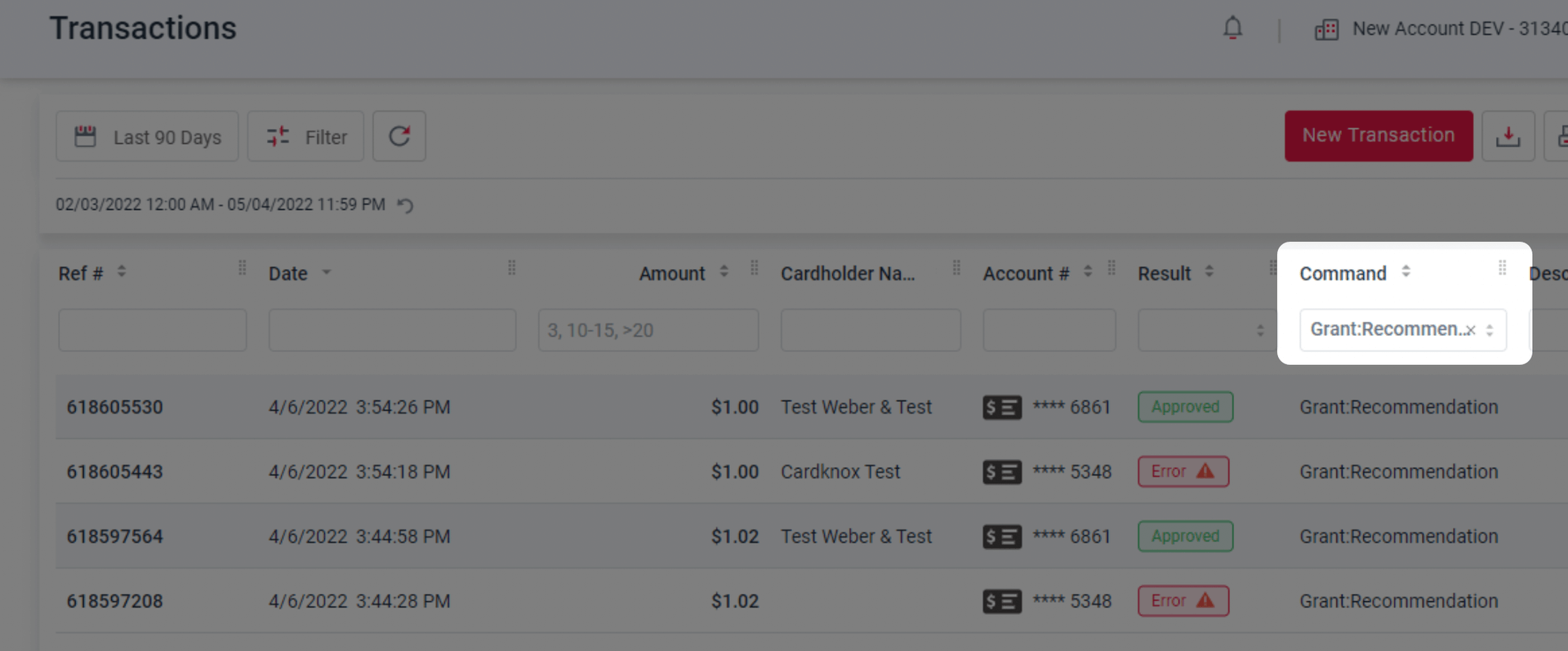
- We’ve added the ability to filter for “Grant” transactions.
- Users can now view Crypto sales as crypto:sales transactions. These can be filtered and included in reporting along with other transactions.
- We now provide the ability for merchants to process EBT Online Voids and Refunds in the portal.
- Users can now see up to 10 transactions at a glance — rather than the previous limit of 3 — and they can see even more by clicking the new “load more” button.

Merchant Portal Display Enhancements
We’ve made a number of enhancements throughout the application based on feedback from our user community. One change you’ll also notice is the Notifications icon. The popup is now closed by default and displays the number of notifications on the icon.

We’ve also made additional minor enhancements to improve error messaging that displays in the event that recurring schedules fail to load.
Bug Fixes
This release involved minor fixes across the Web Merchant Portal and Mobile App. We fixed an issue in which an unexpected error was shown when clicking the Send Payment Request button. We also resolved an issue when activating or deactivating a Recurring Schedule so that the changes display immediately upon activation/deactivation.
Mobile App Enhancements
Biometric FaceID and Fingerprint Now Supported for Mobile Login
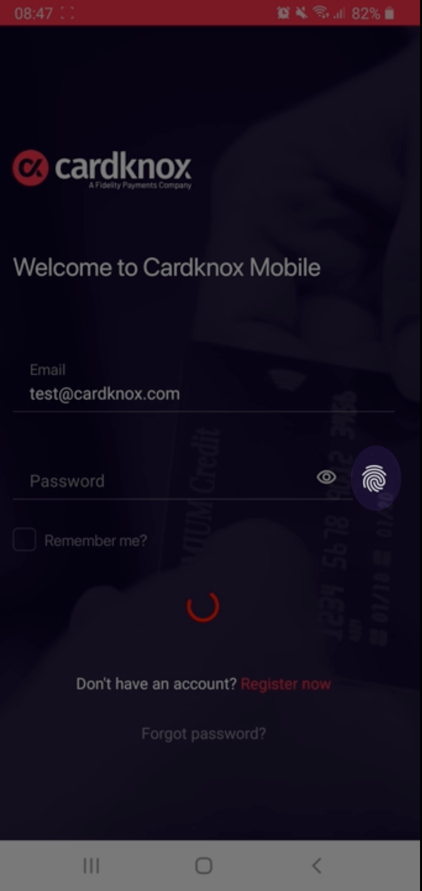
For our merchants using the Mobile App, great news! You can now set up the app to accept your Fingerprint and/or FaceID at login. To configure this, select the icon for FaceID or Fingerprint at the login screen and accept the prompt when you log in. When enabling it for the first time, the app will guide you to the device’s settings.

Search for Transactions With Custom Date Ranges
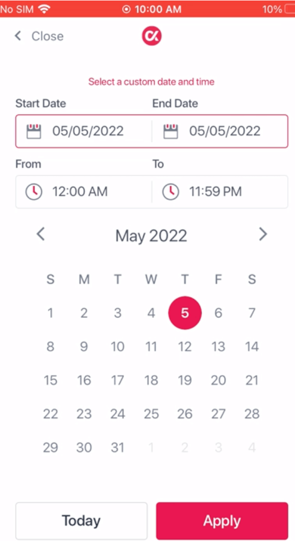
Users of our app can now search for transactions using custom date ranges! This functionality is present for the Transactions and Batches tabs.

Mobile App Experience Enhancements
Buckle your seatbelts and be ready to be blown away by our changes to the Mobile App. You may notice a new animation when logging into the app. You’ll also find that the app version number is included at the bottom of the screen when opening the side panel menu.
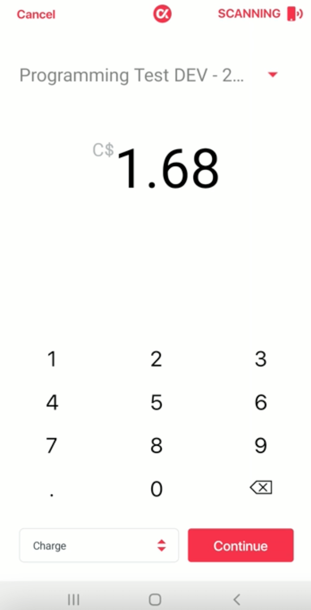
When scrolling through Transactions, we’ve removed the Load More button and enabled automatic rendering of additional transactions as you scroll. We’ve also enhanced the app when creating a new transaction to have the keyboard displayed on the screen.

There are also minor usability changes and additions, such as:
- An added confirmation screen before submitting a voided transaction
- Updated coloring of “OK” button when voided transaction is complete
- Users can now see up to 10 transactions at a glance — rather than the previous limit of 3 — and they can see even more by clicking the new “load more” button.
Bug Fixes
In the Mobile App, we pushed fixes for two critical bugs. We resolved a problem with the enable ACH flow that was preventing users from applying to have ACH supported, and we fixed an issue causing the iOS app to crash on the New Customer screen.
Lastly, we resolved an issue in which selecting an account in the account dropdown was not navigating the user back to the application page.
How's it Going with Cardknox?
If you have a moment, we’d like to hear about your Cardknox experience and what we can change or add to improve your experience. Please take a moment to fill out our feedback form—and thank you!

